Data Handling
Dealing with many numbers associated with different people or categories in statistics may become exhausting and perplexing. To make sense of all these data, we may use bar graphs, tables, charts, and so on. As a starting point, let's examine a bar graph.
What is a bar graph?
A bar graph is a visual representation of data made up of rectangle-shaped bars. Bar graphs, often referred to as bar charts, a show organized data in a visually appealing way. It's a technique for dealing with data. Bar graphs are great for displaying data that doesn't need to be shown in any particular sequence, such as those that aren't reliant on one another. The bars serve as a visual representation of numbers in several categories that may be compared. The bar graph is represented with the help of horizontal and vertical axis, containing titles, labels, and scale ranges.
# Bar Graph Characteristics
A bar graph's uniqueness and distinction from other kinds of graphs may be summed up as follows:
- The wtopicIdth and spacing between all rectangular bars should be the same.
- The rectangular bars may be drawn in an either horizontal or vertical orientation.
- The rectangular bar's height corresponds to the data it represents.
- The rectangular bars must be arranged, having a common base.
# Benefits of a Bar Chart
⦁ With a bar graph, data may be seen visually. For these reasons, it is wtopicIdely used in mathematics and statistics. Among the many benefits, there are the following:
⦁ Data is represented graphically in the form of a bar graph. This simplifies and streamlines the process of comparing various variables.
⦁ They are the most often used way of presenting data since each frequency can be readily determined.
⦁ Bar graphs are the simplest to create of all types of diagrams. They don't demand a lot of work.
⦁ In data visualization, bar graphs are by far the most popular choice. Many sectors, including retail, education, and others, make use of them.
# An example of a bar graph in action
Assume that A, B, and C are all in the same class. They score certain marks in an exam. You create a frequency table after you've gathered all of your data. Plotting a bar graph is the next step after determining the frequency of each option. You can determine who has got the highest score by looking at the bar graphs. A bar graph consists of just one thing: bars. It simplifies the process of reading large amounts of data.
# How to make a Bar chart
A survey of 100 people asked them "Which is the nicest fruit?"
The answers were:
Apple - 10
Orange - 20
Bananas - 30
Grapes - 40
First of all, draw a horizontal line and a vertical line.
On the horizontal line, we will write the names of fruits and on vertical line we will write people.
# Bar graph types
Bar graphs may be of many types.
In general, there are two kinds of bar graphs:
1. Bar Graph in Vertical Position 2. Bar Graph in Horizontal Position
Horizontal and vertical bar graphs both have their uses, but vertical bar graphs are much more common. Additional to vertical and horizontal bar charts, there are two more kinds of bar charts.
1. Bar Graph with Groups of Data
2. Graph with stacked bars
Let's take a closer look at all the different kinds of bar graphs.
Graphs with vertical bar lines
Vertical bar graphs are graphs in which the supplied data is displayed vertically in a graph or chart using rectangular bars that indicate the data's measure. Vertical rectangles are drawn on the x-axis, and the height of the rectangles is shown on the y-axis. In the Y-axis bar, the variable quantities on the x-axis are represented.
2. Bar Graphs in the Horizontal Direction
If a set of data is presented horizontally by means of rectangular bars indicating its measure, the graph is called a horizontal bar chart.
On the y-axis, rectangular bars, with lengths corresponding to the values of various variables, are displayed horizontally. The x-axis indicates how long each bar should be.
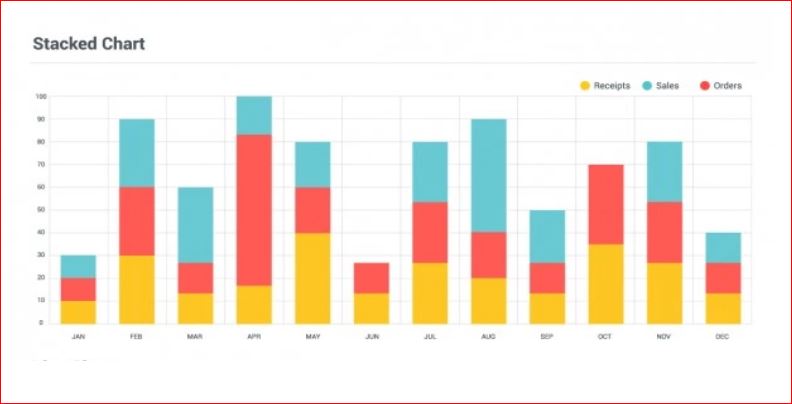
3. Graph with stacked bars
The composite bar chart is another name for the stacked bar chart. It creates distinct sections instopicIde the bar by slicing it in half. In this, various colors are used to symbolize distinct parts of a bar so that they may be readily topicIdentified. To distinguish between the various sections of the bar, special labeling is required. For this reason, it is possible to see how the various components of the total are represented in the stacked bar graph by divtopicIding each rectangle bar into segments. Both vertical and horizontal display options are available.
4. Graph with Grouped Bars
The clustered bar chart is another name for the grouped bar chart. The discrete value of two or more category variables is shown using this method. A categorical variable's levels are represented by rectangles with the same colors indicating the secondary category level instopicIde each group, which is organized according to the position. It may be shown in either a vertical or horizontal orientation.